
краткое содержание:
- конкурс на реддите
- моя подготовка с выбранной уже миниатюрой
- мой сборник ссылок на варианты раскраски выбранной миниатюры
- сданная работа
- мой подробный отчёт
результат
финалисты малой формы в категории для начинающих 📊
| автор | композиция | исполнение | палитра | тематичность | ссылка | финальное место |
|---|---|---|---|---|---|---|
| NeverD1es | 292 | 306 | 272 | 292 | Mussellar Sergeant | 🥇 №1 |
| Informal_Gur2646 | 277 | 302 | 279 | 335 | Gardening Golem | |
| Mr_Cohen | 291 | 277 | 277 | 300 | Awlrach the Drowner | 🥉 №3 |
| lifelessgesture | 233 | 310 | 276 | 300 | Two Frogs | 🥈 №2 |
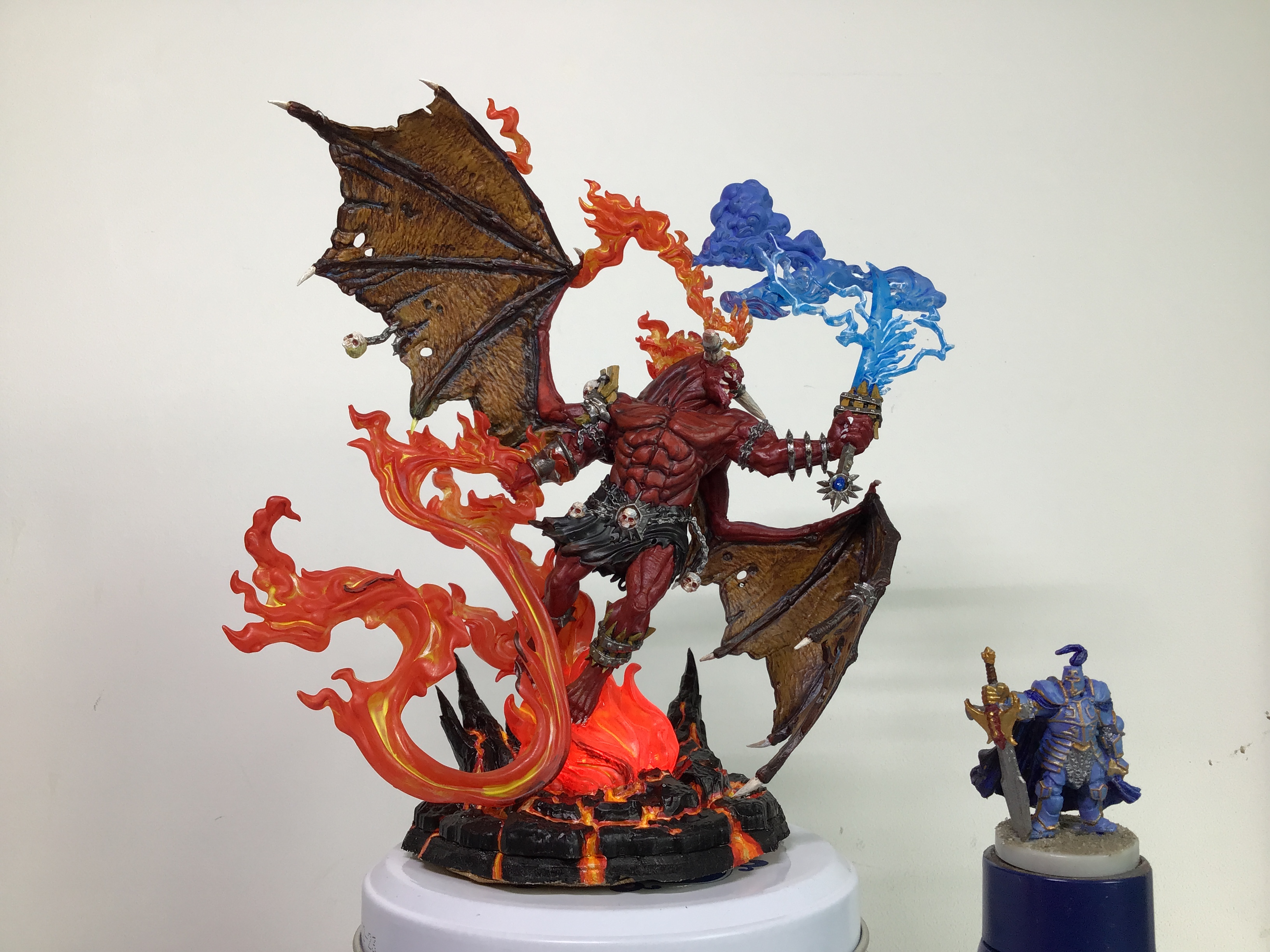
| RadaghastKary | 263 | 256 | 252 | 320 | Balor | |
| моё место по очкам | (№4) | (№5) | (№5) | (№2) |
полученная критика 📊
Hendarion
The body would benefit from more contrast. It's lacking the certain punch. The fire under the feet feels very neon while the flame-lash is more plain orange. Using the same tones would work better, I think. The blue clouds above the head would work much better, I think, if they were grey and had a much stronger contrast. The black loin cloth also could benefit a lot from stronger highlights.
Roman Lappat
A wild piece. A lot of things going on with my eyes not really able to focus on anything. The warm/cold contrast is strong and first I thought I am looking on a duel from the color palette. Then I realized it is a ice cold wind weapon. Makes sense to the theme. I really like the boldness how the theme is implemented. BAM! Full into lava base (well done for a beginner), flame whip, BAM!, air ice sword! BAM! BAM! ... my eyes never get the to the rest on the demon. He feels not attached to the effects. While I think the effects are the strongest here it is a little sad that the model itself gets lost in these. Both could have worked better if the demon would be much darker. Than a contrast between BAM! effects and a shadow would appear or even maybe the effects could gently influance the demon and effect him by glow. Technical it is ok all over, some parts work really well (like the face) and others get lost in the overall BAM! of the effects. Of course this is a very ambitious piece with lots of elements going on and this is - considered to the theme - really appreciated. It mainly misses out on defintion, readability and focus.
aPoliteCanadian
I like that you've really let the elements be the main focus here. They're definitely the brightest and eye catching parts of the piece.
I think that the red skin could benefit from some brighter highlights. When you highlight red, it's best to do it with oranges rather than just mixing white into it which will result in pink. You can mix in either a yellow or an orange into your base red colour to get to a good shade that would work for a highlight colour, and applying that to some select high points on the face and upper body I think would help it a lot.
общий итог
- вышел в финал — очень круто.
- не взял призовое место — штош.
- участие очень тонизирует, надо чаще так собираться.
- считал, что крылья получились на отлично, но их судьи не заметили.
- а вот лаву заметили, это успех.
- надо работать дальше!